


The Solution
Create a micro site that exclusively offers Johnston & Murphy shoe lines that are perfectly pared to match the clothing selected on the Rye 51 website.
Research Methods
Click Icons to View Details
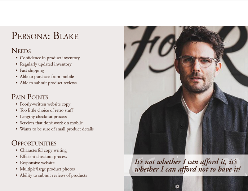
Research Results
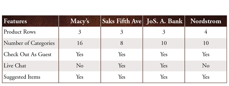
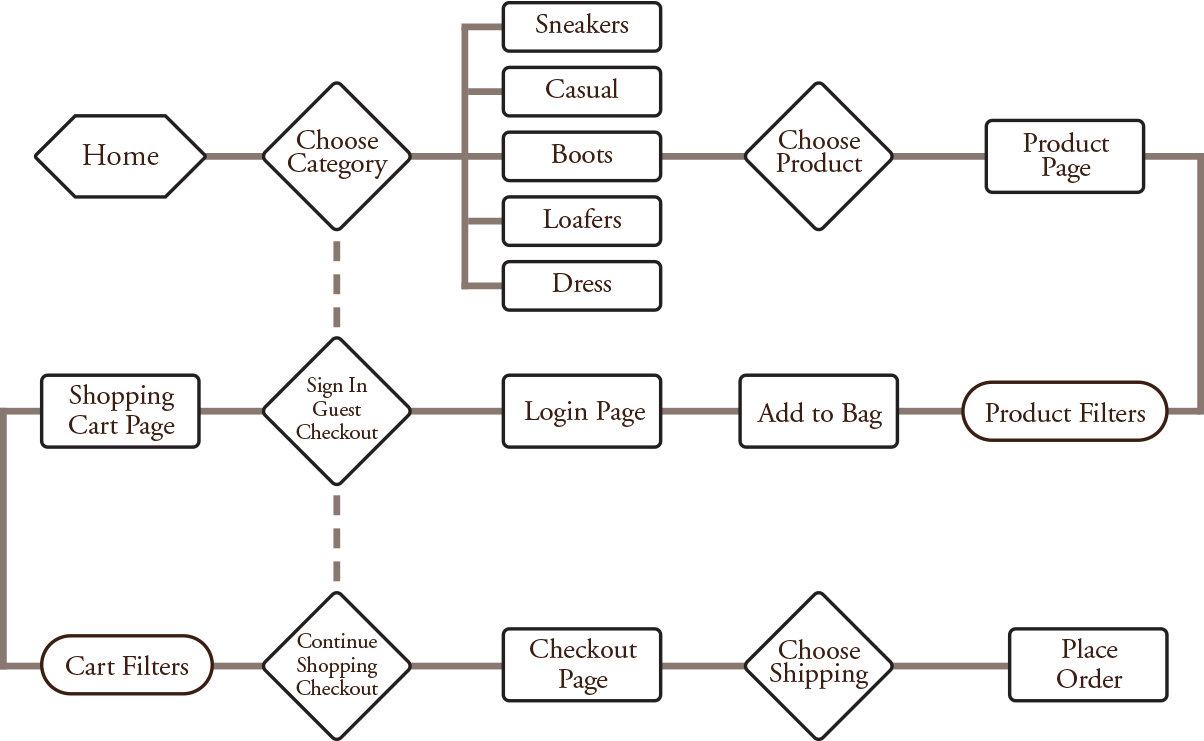
Comparative & Comparative Analysis
After conducting the C & C analysis it became clear that a variety of categories were needed as well as guest checkout and suggested item carousels.
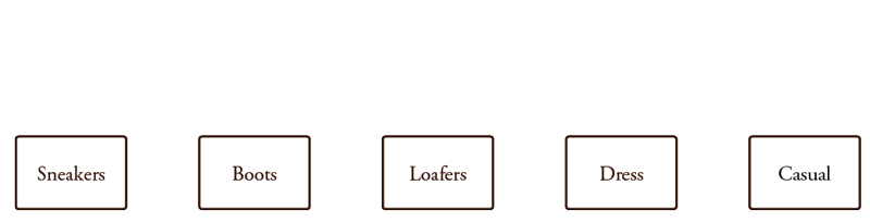
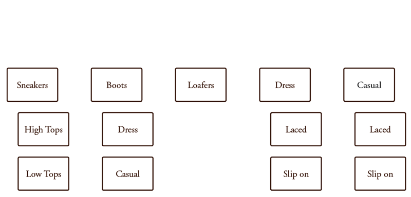
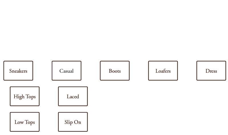
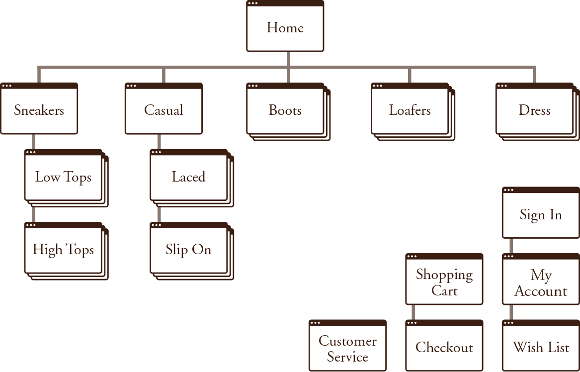
Card Sort Summary
After the initial round of card sorting, several sub categories were added. During the second round, adjustments were made in between each user. The main categories were reordered and several sub categories were eliminated. The result can be viewed by clicking the card sort icon above.


