
→ Information Architecture Created
The Challenge
DuPont is a world leader in science and technology innovation. Great Stuff is a line of consumer and professional grade spray foam, spray foam insulation, tools and silicon caulking products that can be found at any home improvement store. The current Great Stuff website has several challenging issues including poor navigation, and a clear lack of IA direction. In addition to these challenges we were tasked with creating an industry leading omni-channel experience, promoting Great Stuff’s innovative dispensing technology and creating a clear delineation between consumer and professional grade products.
The Solutions
Create a new standard for DuPonts consumer facing websites that’s user focussed, informative, and repeatable. We will achieve this by completing a landscape analysis, creating a focused IA plan and reviewing recent in-depth research studies provided by the client. From this we hope to gain a better understanding of the clients needs and the need of users to help reduce friction, improve comprehension of product offerings and ultimately increase sales of the Great Stuff & Froth-Pak line of products.
My Role

I was the primary lead on this project with support from Rachel Starnes, EVP, Experience Design Director. My responsibilities included conducting research, leading client meetings and developing the creative and IA direction for the project. In addition I was also responsible for developing layouts and design library for the new consumer facing platform.
Research Methods and Results
Landscape Analysis
An in-depth analysis was conducted of the current Great Stuff website as well as a deep dive into their competitors. We examined navigation, content strategy and SEO.
Click the icon to the left to open the full report.
Stakeholder Interview
The Stakeholder interview reviled the need to create a clear delineation between consumer and pro products. We ultimately decided to separate the FROTH-PAK line of products from Great Stuff by creating a second website. In addition we discovered the need to educate consumers on the different dispensing technologies offered by Great Stuff.
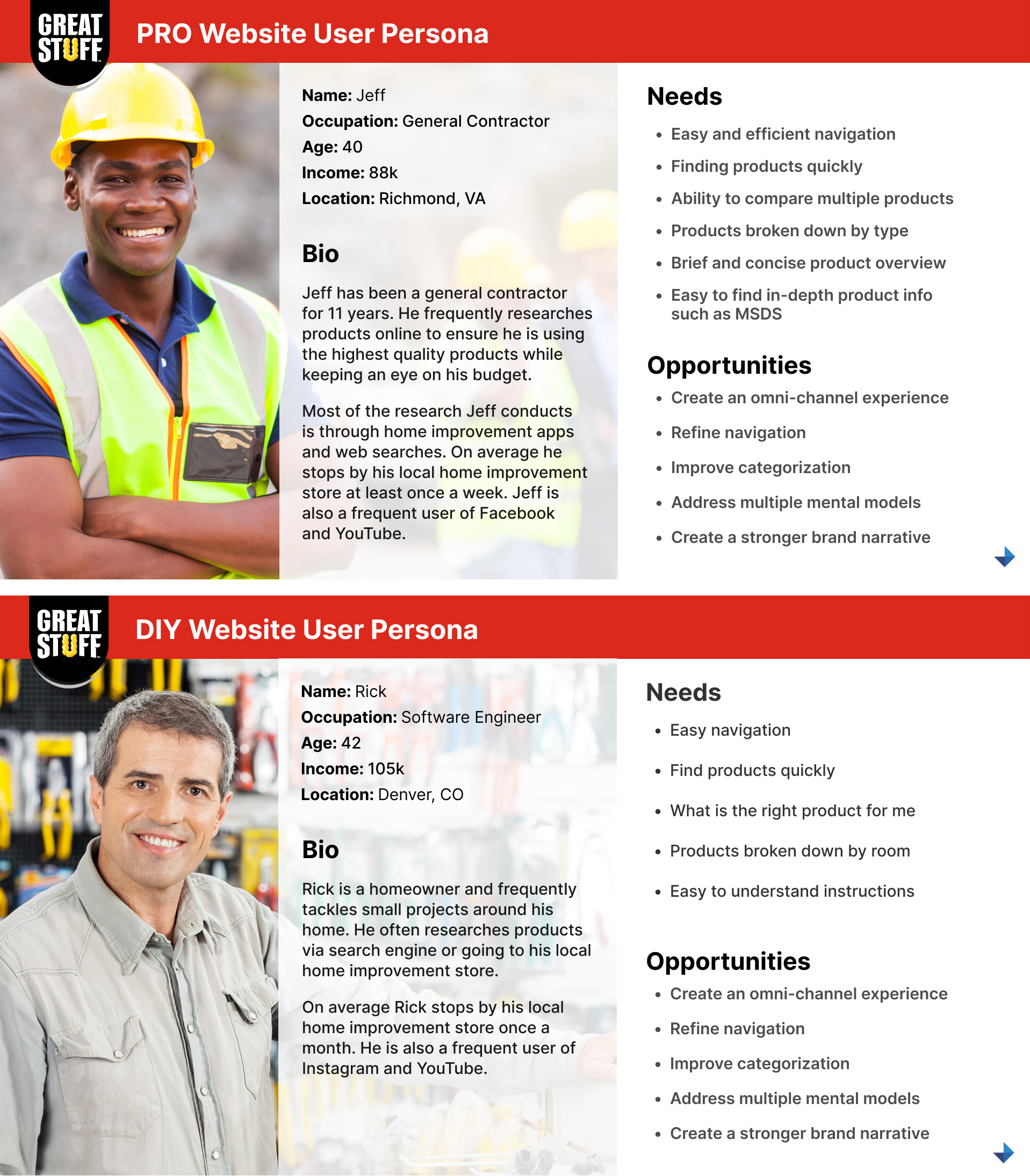
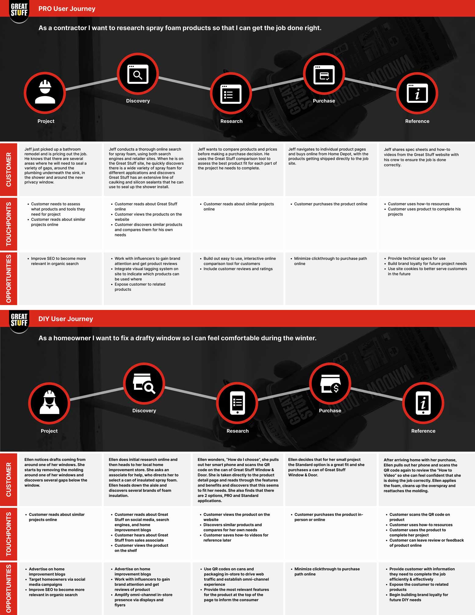
Research Review
We were fortunate enough to have an in-depth user research report conducted by Radius Global Market Research. This gave us the necessary insight to properly address user needs during the development of this project.
Key Insights

- Froth-Pak and Great Stuff need to be split into separate websites to create a clear delineation between consumer and pro grade products.
- Navigation and architecture need to be overhauled.
- Content strategy needs to be clearly defined.
- Animation needs to be reduced and used to bring attention to key items.
- Educational content need to be more accessible and specific to each product.
- New creative and visual direction needs to be defined.
- New categories and category pages needed to define structure.
- Help items need to become internal to the Great Stuff site rather than going out to the DuPont parent site.
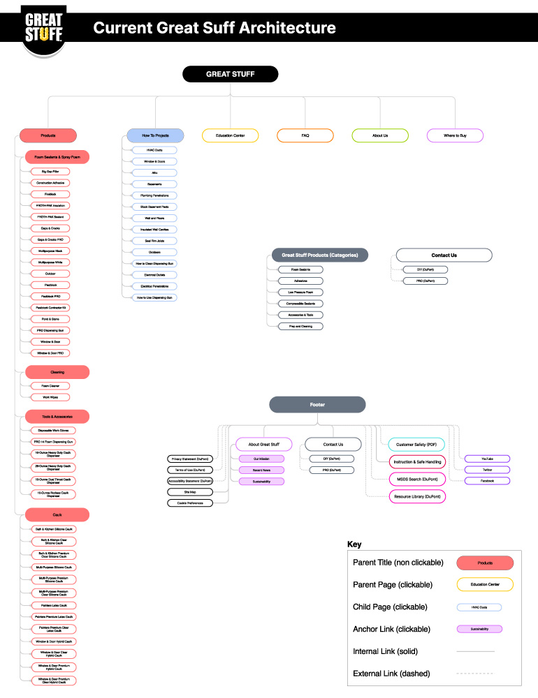
Information Architecture
Click Images to View


Great Stuff User Interface
Click Images to View


FROTH-PAK User Interface
Click Images to View


User Interface Key Features

Design system and structure to aid efficient and repeatable consumer website builds.
- Related brand navigation bar.
- Category and project based navigation.
- New visual direction based on demographic research.
- Selective animation used to highlight key features.
- Enhanced resource and help sections.
- Product comparison tool.
- Clear and concise hierarchy of content.
Results
By implementing a proper architectural structure and reducing the amount of animation, we should see a dramatic reduction in cognitive load. Allowing the user to easily drill down to a final product selection should also help alleviate user frustration in finding the correct product for each project.
Additionally we implemented a new content strategy that is focused on communicating in a clear and direct way. The creation of the new design system will help to reduce production costs on all consumer facing websites moving forward.