Case Study Overview

Rye 51 is a men’s fine clothing retailer, that currently has a limited selection
of footwear to pair with their clothing lines. Johnston & Murphy is primarily
a men’s fine shoe producer. We believe there is space for these two
companies to work hand in had to provide customers with a complete
online clothing experience.

The Challenge

Create an engaging and seamless solution for Rye 51 and Johnston & Murphy to collaborate and provide the perfect clothing solution.

The Solution

Create a micro site that exclusively offers Johnston & Murphy shoe lines that are perfectly pared to match the clothing selected on the Rye 51 website.

Research Methods

C&C Analysis
Semi Open Card Sort 1
Semi Open Card Sort 2
Semi Open Card Sort Final

Click Icons to View Details

Research Results

Comparative & Comparative Analysis

After conducting the C & C analysis it became clear that a variety of categories were needed as well as guest checkout and suggested item carousels.

Card Sort Summary

After the initial round of card sorting, several sub categories were added. During the second round, adjustments were made in between each user. The main categories were reordered and several sub categories were eliminated. The result can be viewed by clicking the card sort icon above.

Synthesis Methods

Persona
Site Map
User Flow

Click Icons to View Details

Conceptualization

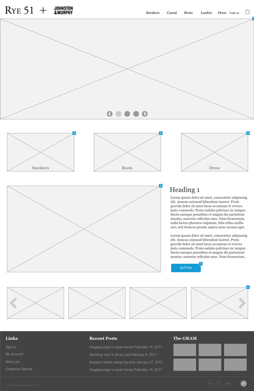
Home Page

1
2
3
4
5
6
1

Main navigation that features drop downs for subcategories.

2

Shopping cart icon with drop down options.

3

Hero slider showing featured items.

4

Clickable product images that represent the 3 top categories.

5

Featured product section with write up and button linking to featured product.

6

Carousel of new products.

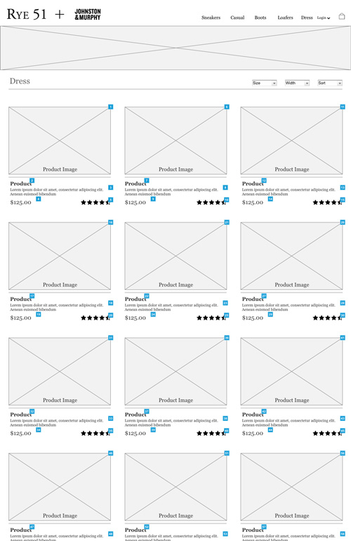
Category Page

1
2
3
4
5
1

Header image.

2

Size, width and sort filters.

3

Clickable product image.

4

Clickable product title, description and price.

5

Clickable star rating that opens a list of ratings in a lightbox container.

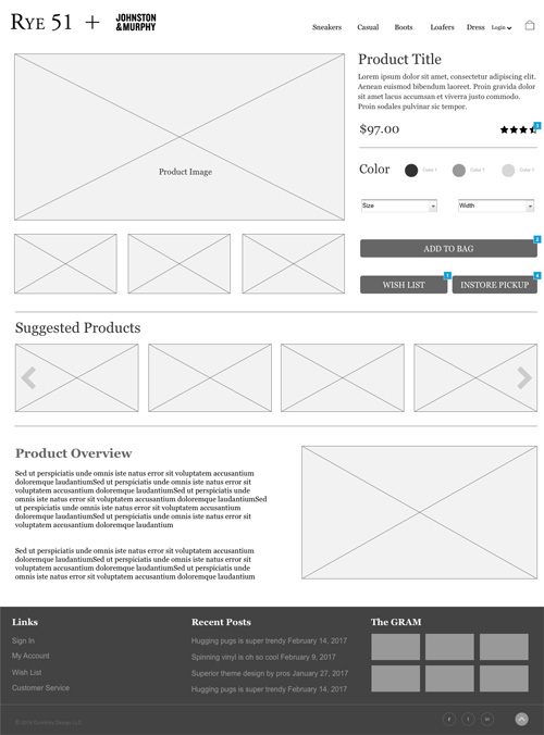
Product Page

1
2
3
4
5
6
7
8
1

Product image and with additional thumbnails below.

2

Product title and description.

3

Clickable star rating that opens a list of ratings in a lightbox container.

4

Product filters including color, shoe size and width.

5

Clickable add to bag (add to cart) button.

6

Add item to wish list.

7

Carousel of suggested products.

8

Detailed product description.

User Testing

1st Round Usability Test

Users were asked to select a shoe and follow through to checkout. Following each test, users were asked if any improvements could be made.

The following changes were made

  • Continue shopping button added to the shopping cart page.
  • “Your order is complete” confirmation added after user clicks Place Order button on the checkout page
  • Return to shop button added to the confirmation message on the checkout page.
Round 1

2nd Round Usability Test

Users were asked to select a shoe and follow through to checkout. Following each test, users were asked if any improvements could be made.

The following changes were suggested

  • Add chat function
  • Convert sign in page to pop up window
  • Add PayPal and Apple Pay options to expedite checkout.
Round 2

Results

After conducting usability testing we found that most of the initial pain points have been addressed. We now have a clearly defined structure that we can build on and expand.